Monday, May 27, 2013
Reflections on 2013
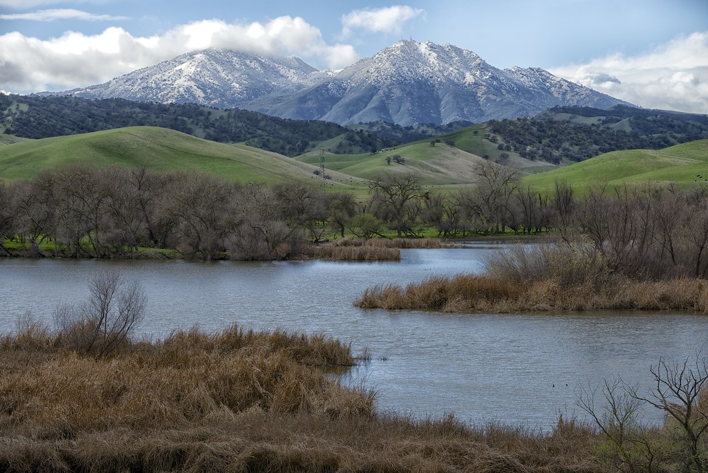
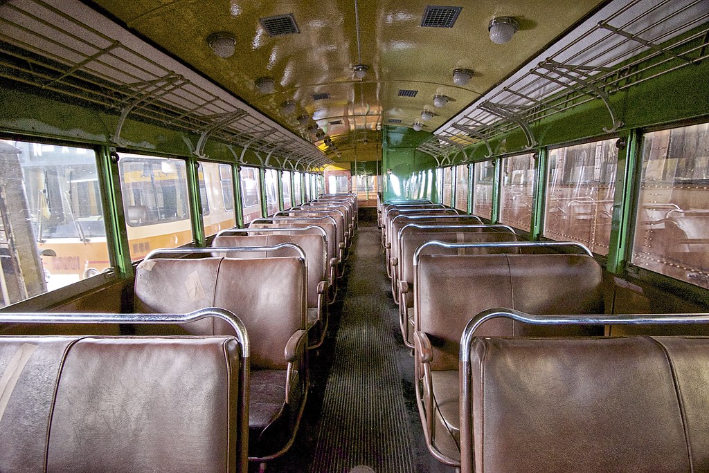
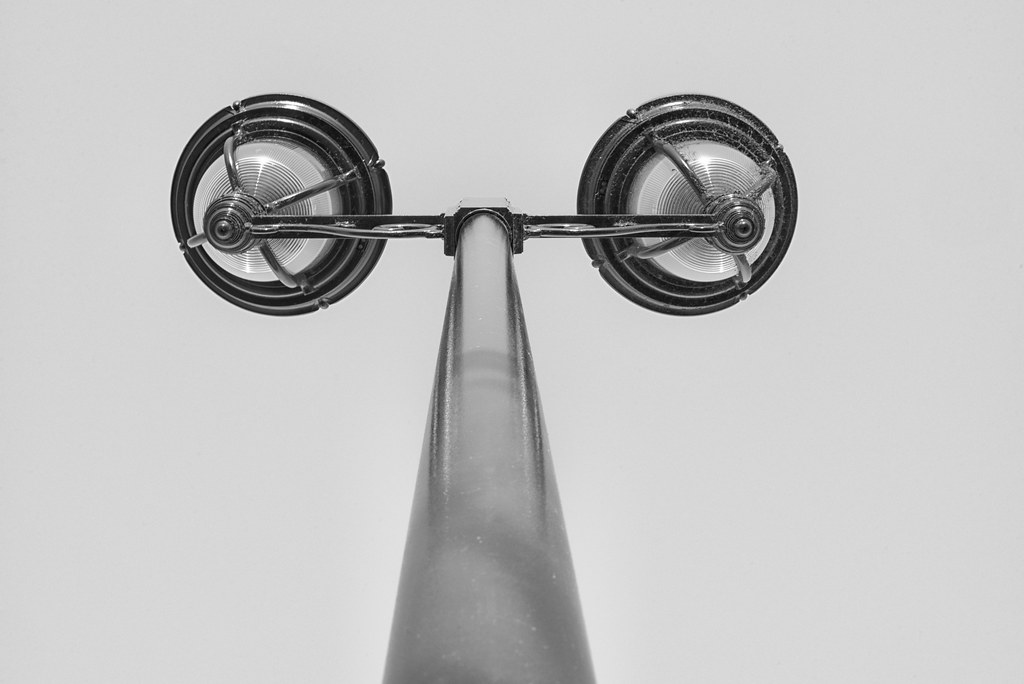
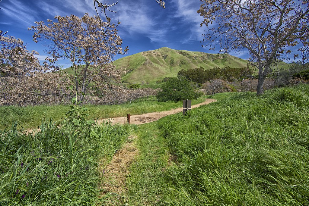
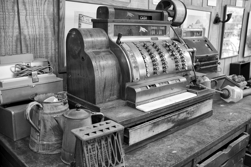
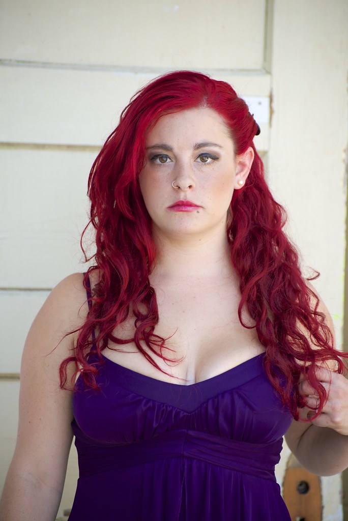
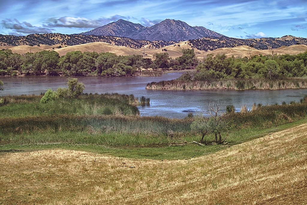
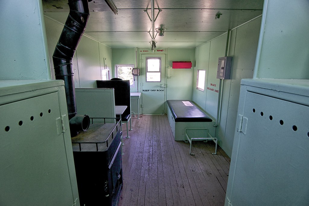
We are approaching the 1/2 way point for the year, so I thought it would be a good idea to post what I consider to be my best work of the year so far. By the end of the year, I wonder which of these images will be removed from the list. Overall I feel like I have shot a lot of crap with very few "keepers". These are my keepers. What are your best pics this year?
Wednesday, May 22, 2013
My take on the big Flickr Change
Like many of you, the change at Flickr was pretty intense when I first saw it. Bang! Everything is new. I actually noticed something was "wrong" the day before they went live with the new website. I was trying to upload some pics from Aperture when the upload failed and I had to re-authenticate Aperture with Flickr. Maybe unrelated. Who knows.
Anyway, I have been a Pro subscriber for about 2 years now. I use Flickr to store all of my edited images (good or bad) so that I have easy access to them when doing blog posts, tweets or any other time I need access to an image. Flickr has become part of my workflow. Every day I check flickr for new activity and most importantly for the stats.
What used to be as simple as visiting flickr.com now involves going to flickr.com and I then have go to a menu and select either "stats" or "recent activities". The recent activity screen does not use the same layout of the old default activity summary. I prefer the old summary. I hear the free and "ad free" accounts have no stats. They should at least offer google analytics support.
Sets
I really do not like the new layout to view sets. Before a visitor could see my most recent pictures and a list of the sets on the right side. Visitors would always see both. Now sets are basically hidden and most people will never click on the Sets tab to see what sets I have created. Flickr went from offering us multiple layout choices to no choice at all.
"Edit Menu"
To view the "classic" Flickr screen with all of my photos, I have to click Edit. Silly. I don't want to edit anything. I want to view comments on my pictures and the total hits.
On my 13 inch Macbook, 1/3 of the screen is taken up by the cover photo in the edit screen. Once I start scrolling I can only see 2 rows of pictures. I can live with this, but still annoying.
I wish I could view this "classic" layout on everyone else's page, like we could before.
Once I click on a photo I get the new super ugly picture layout which forces me to scroll down to view comments from users. I challenge you to figure out how to view different sizes of your own image. No obvious menu exists for this. If I right click on my photo, I get an annoying window with size choices:
Cover Photo
Did you notice that the Cover Photo interface allows you to only select "recent" pictures or upload a picture. What are they thinking? The entire reason Flickr exists is to store my photos, yet I can't pick an old photo as my Cover image. I have to upload an old photo that I have already uploaded to Flickr six months ago. #fail. Pathetic design choice. The list of these recent photos appears to also be at a low resolution, which is just ugly. I should have access to my entire photo collection.
Ads
I still have ads on my Groups list. I know I am just a "Pro" user and not "ad free", but that seems like a mistake.
Buttons
The new buttons within the interface do not have tool tips, so you don't know what they do until you click the button.
Contacts
The only thing I like about the new interface is that I can see big versions of my contacts pictures. I am clicking the star more often for my contacts.
Bottom line
I think Flickr screwed up with the new pricing model. They have increased the price for anyone who doesn't want to view ads and who isn't an old "pro" account holder. Not only do you pay twice the price of the old pro account, but you get less for the money. You don't get "unlimited" storage and you don't get stats. 1TB of storage is just smoke and mirrors so that you drink the KoolAid. 1TB of storage is great buzz for the press, but what about the things you don't get?
I want a layout choice. The best thing Flickr could do is to offer a "classic layout" choice. When most websites roll out major changes, they give users a transition period at the least, which includes a button to switch between layouts. Flickr didn't consider this or just didn't care about the existing customer base. Am I going to stop using the service? No. It still serves my needs, I just have to click a lot more to get things done.
Anyway, I have been a Pro subscriber for about 2 years now. I use Flickr to store all of my edited images (good or bad) so that I have easy access to them when doing blog posts, tweets or any other time I need access to an image. Flickr has become part of my workflow. Every day I check flickr for new activity and most importantly for the stats.
The Bad
Stats and Activity pagesWhat used to be as simple as visiting flickr.com now involves going to flickr.com and I then have go to a menu and select either "stats" or "recent activities". The recent activity screen does not use the same layout of the old default activity summary. I prefer the old summary. I hear the free and "ad free" accounts have no stats. They should at least offer google analytics support.
Sets
I really do not like the new layout to view sets. Before a visitor could see my most recent pictures and a list of the sets on the right side. Visitors would always see both. Now sets are basically hidden and most people will never click on the Sets tab to see what sets I have created. Flickr went from offering us multiple layout choices to no choice at all.
"Edit Menu"
To view the "classic" Flickr screen with all of my photos, I have to click Edit. Silly. I don't want to edit anything. I want to view comments on my pictures and the total hits.
On my 13 inch Macbook, 1/3 of the screen is taken up by the cover photo in the edit screen. Once I start scrolling I can only see 2 rows of pictures. I can live with this, but still annoying.
I wish I could view this "classic" layout on everyone else's page, like we could before.
Once I click on a photo I get the new super ugly picture layout which forces me to scroll down to view comments from users. I challenge you to figure out how to view different sizes of your own image. No obvious menu exists for this. If I right click on my photo, I get an annoying window with size choices:
Cover Photo
Did you notice that the Cover Photo interface allows you to only select "recent" pictures or upload a picture. What are they thinking? The entire reason Flickr exists is to store my photos, yet I can't pick an old photo as my Cover image. I have to upload an old photo that I have already uploaded to Flickr six months ago. #fail. Pathetic design choice. The list of these recent photos appears to also be at a low resolution, which is just ugly. I should have access to my entire photo collection.
Ads
I still have ads on my Groups list. I know I am just a "Pro" user and not "ad free", but that seems like a mistake.
Buttons
The new buttons within the interface do not have tool tips, so you don't know what they do until you click the button.
Contacts
The only thing I like about the new interface is that I can see big versions of my contacts pictures. I am clicking the star more often for my contacts.
Bottom line
I think Flickr screwed up with the new pricing model. They have increased the price for anyone who doesn't want to view ads and who isn't an old "pro" account holder. Not only do you pay twice the price of the old pro account, but you get less for the money. You don't get "unlimited" storage and you don't get stats. 1TB of storage is just smoke and mirrors so that you drink the KoolAid. 1TB of storage is great buzz for the press, but what about the things you don't get?
I want a layout choice. The best thing Flickr could do is to offer a "classic layout" choice. When most websites roll out major changes, they give users a transition period at the least, which includes a button to switch between layouts. Flickr didn't consider this or just didn't care about the existing customer base. Am I going to stop using the service? No. It still serves my needs, I just have to click a lot more to get things done.
Saturday, May 11, 2013
More Nikon D600 vs Fujifilm X100s
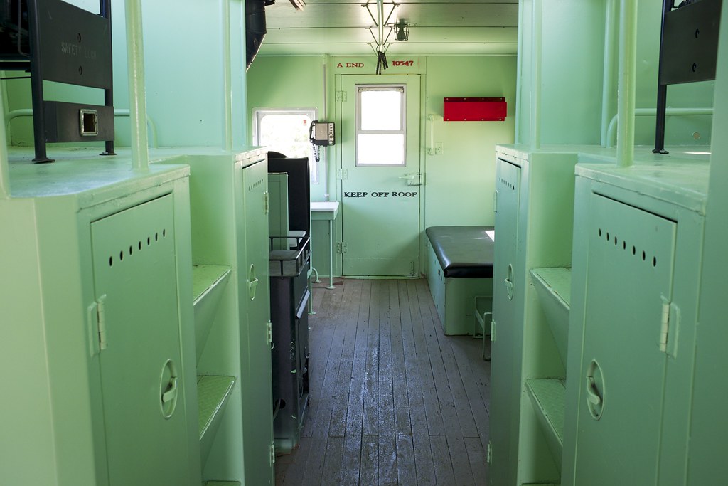
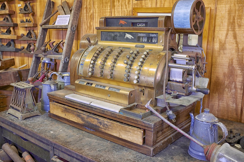
I have been shooting with the x100S for a few weeks now and every day I use it, I am more impressed with the Fujifilm image quality. At times I love the results much more then the Nikon D600. In mixed lighting situations, I find I have more control over the x100s.
A few comparison shots:
Windmill
Interior of a train
Cash Register
A few comparison shots:
 |
| D600 |
 |
| X100s |
 |
| X100s |
 |
| D600 |
 |
| X100s |
 |
| D600 |
Cash Register
 |
| X100s |
Labels:
comparison,
D600,
Fuji,
Fujifilm,
image quality,
Nikon,
results,
side by side,
x100s
Subscribe to:
Posts (Atom)

